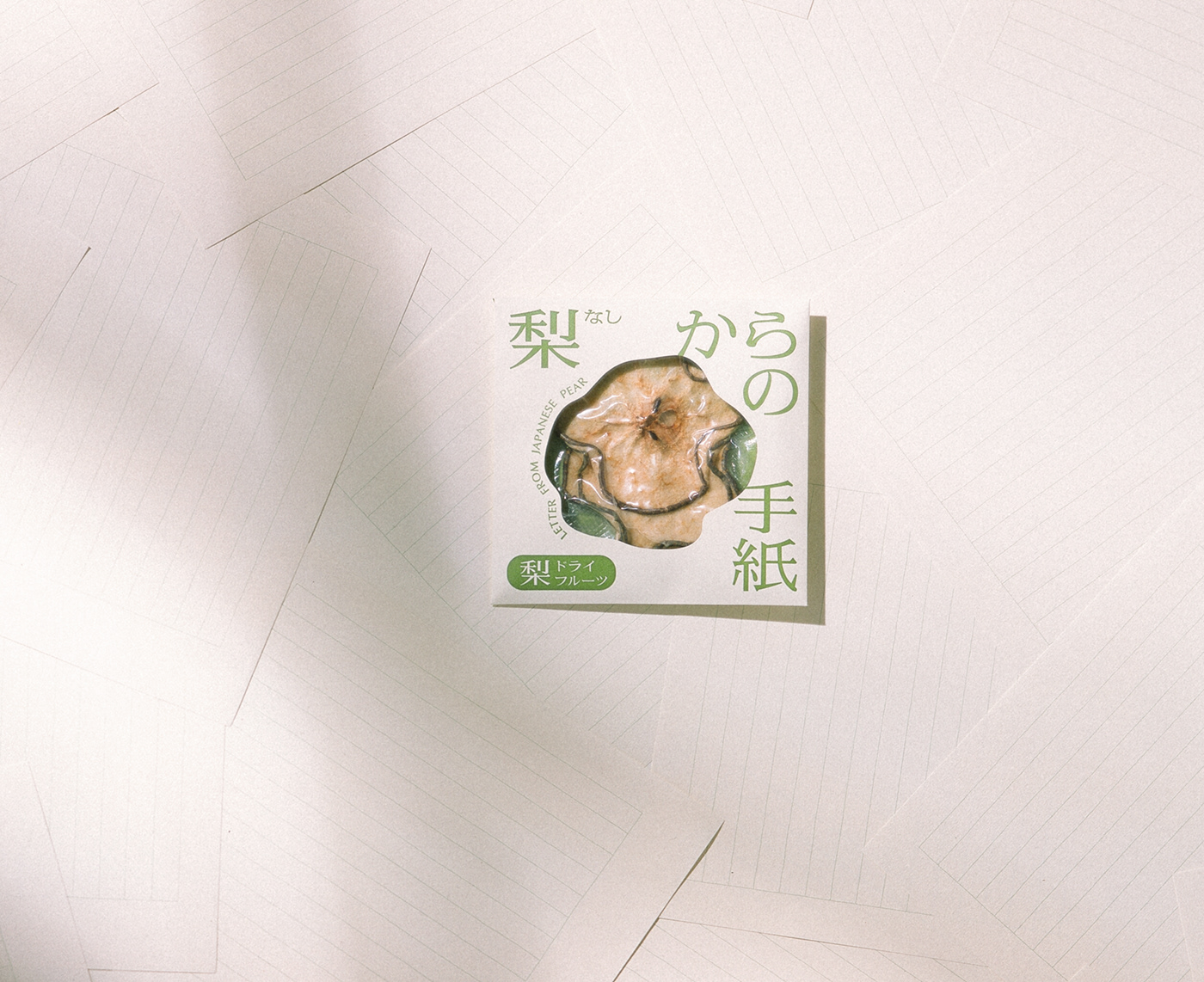
Letter from japanese pear
Branding design for "Letter from Pear", a dried fruit made from 20th Century Pears.
Art direction, naming, logo design, and package design were done by overlaying the dried pear, which exudes sweetness as it is chewed, on a letter.
The package was designed in the shape of a letter, using dried pears as the letterhead. The front of the package is hollowed out in the organic shape of the dried pear, creating a coexistence of nostalgia and novelty.
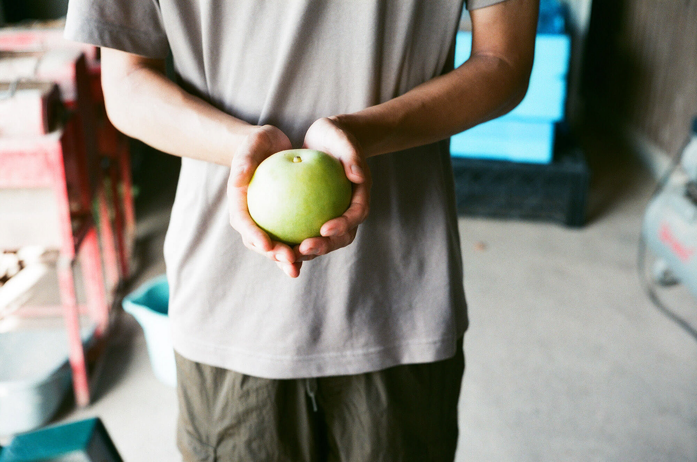
The photographs were taken with several types of film cameras, with an awareness of the textures of the twentieth century.
Art direction, naming, logo design, and package design were done by overlaying the dried pear, which exudes sweetness as it is chewed, on a letter.
The package was designed in the shape of a letter, using dried pears as the letterhead. The front of the package is hollowed out in the organic shape of the dried pear, creating a coexistence of nostalgia and novelty.
The photographs were taken with several types of film cameras, with an awareness of the textures of the twentieth century.
梨からの手紙
二十世紀梨を使用したドライフルーツ【梨からの手紙】のブランディングデザインを担当。
噛むごとに甘さが滲み出るドライ梨を手紙に重ね、アートディレクション、ネーミング、ロゴデザイン、パッケージデザインを行なった。
パッケージはドライ梨を便箋に見立てて手紙の形に。表はドライ梨の有機的な形でくり抜き、懐かしさと新しさを共存させた。
写真は二十世紀の質感を意識し、数種類のフィルムカメラを使用。
噛むごとに甘さが滲み出るドライ梨を手紙に重ね、アートディレクション、ネーミング、ロゴデザイン、パッケージデザインを行なった。
パッケージはドライ梨を便箋に見立てて手紙の形に。表はドライ梨の有機的な形でくり抜き、懐かしさと新しさを共存させた。
写真は二十世紀の質感を意識し、数種類のフィルムカメラを使用。